Project Details
Client:
Rhythm Nutrition
Type:
Design & Development.
Objective:
Increase sales.
Tools:
Figma, Webflow, Finsweet, Subbly, Geo-Targetly
Overview
Rhythm Nutrition produces top-quality health products, including the award-winning Deflame. Though originally built in-house, their website required a complete rebuild to enhance the overall customer experience, from the landing pages to the purchasing process, with a special focus on optimizing the mobile experience.
Approach
Brand refresh.
Clean up brand with improved typography and uppercase logotype.
Aesthetics re-think.
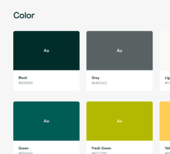
Over 50% of site users accessed via mobile, so I developed an app-like feel with a fixed navigation bar. A fresher color scheme was chosen to create contrast.
Content rebuild.
Revamped blog and recipe sections with custom code for improved design, clean recipe printouts, and social sharing. Custom reviews tool developed with Amazon-like aesthetics using Webflow collections powered by Airtable.

Process replacement.
I introduced Subbly to replace Foxy Cart and Geo-targeted pricing with Geotargetly.
Conclusion
The results have been amazing since the launch of the new site. Whilst I am not at liberty to show the financial figures the are up in some case 50%. With the new tools, features, and renewed focus on mobile customers, Rhythm Nutrition is in a good place for future expansion.
The site has been designed to be managed by the in-house team and has been a success. Don't take my word for it; read what the site owners wrote below.
Client Comments
“I cannot thank Chris enough for the thought and effort he has put into our business. I am almost reluctant to recommend him in case he becomes too busy to work on my projects in future but that would be selfish, and I'm trying to be better:).
It took some convincing but I'm so glad we listened to his advice. Our entire customer experience has been improved, my fixed costs have reduced, my processes have been streamlined. That's before the beautiful, fast, well designed website he built for us from scratch.
Great communication, reliable and prompt. A pleasure to work with.”


